Project Description
Logo Design for Edmonds Security
CHALLENGE
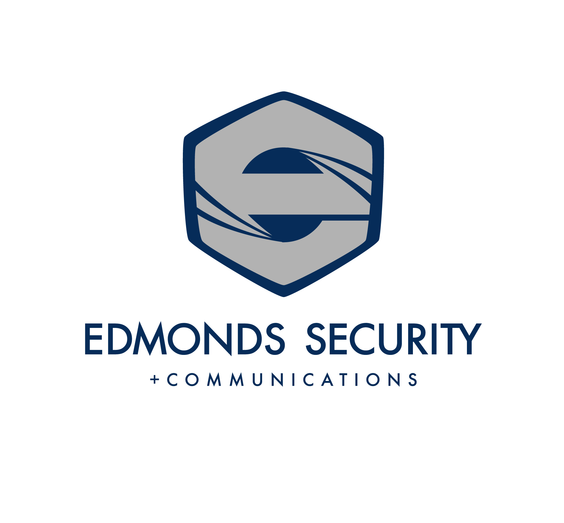
Edmonds Security and Communications was in need of a Brand Identity. We developed this Logo Design for Edmonds Security with their target audience in mind. After a thorough discovery process, we felt the need to include casino elements because their main target audience is Reservation Casinos in Washington.
SOLUTION
After extensive research, this was the main concept we developed for the final Edmonds Security logo design. As you may notice, the icon shape is made up of the lowercase letter “E” formed by the shape of a casino “die” at a perspective angle.
RESULT
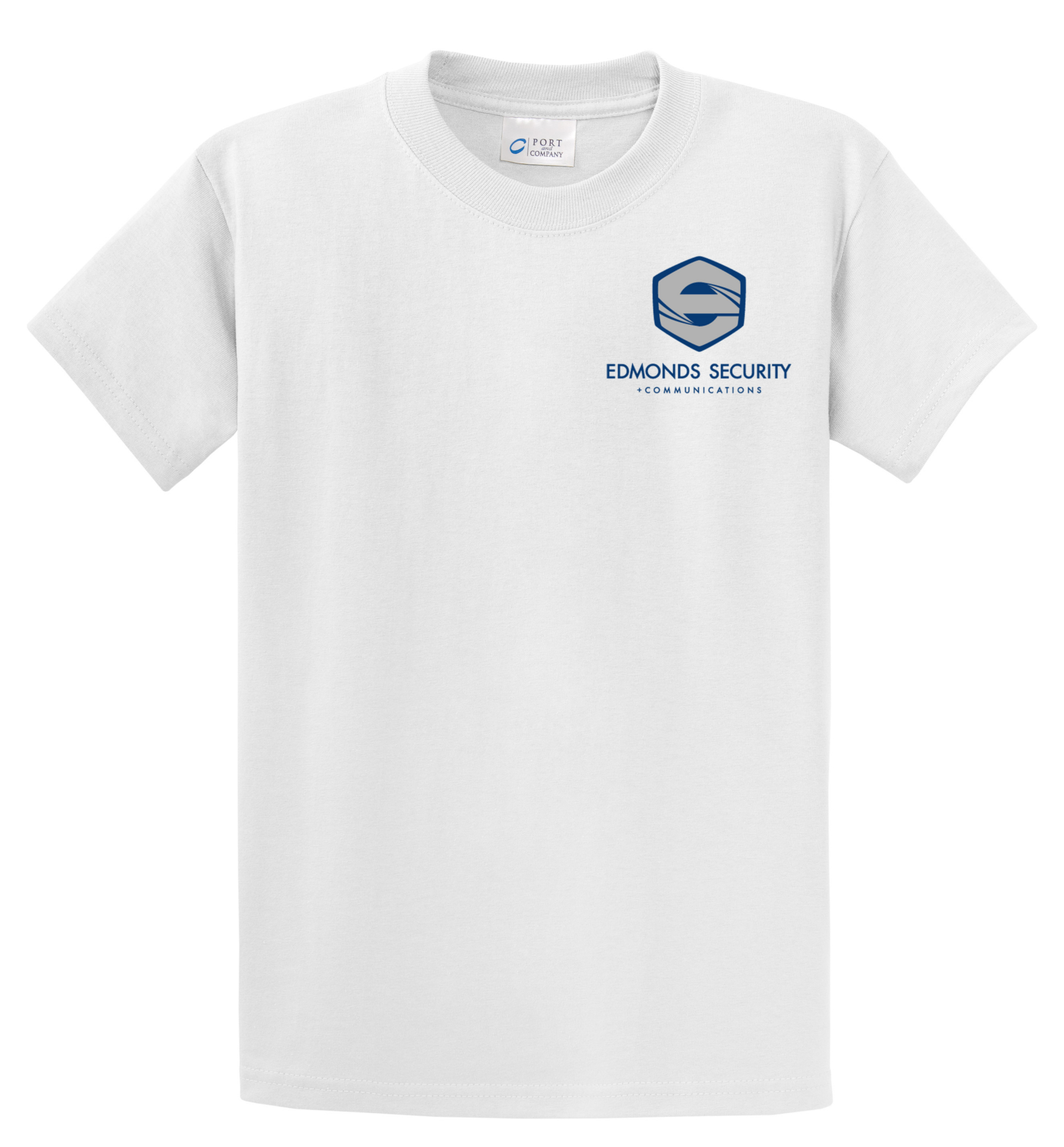
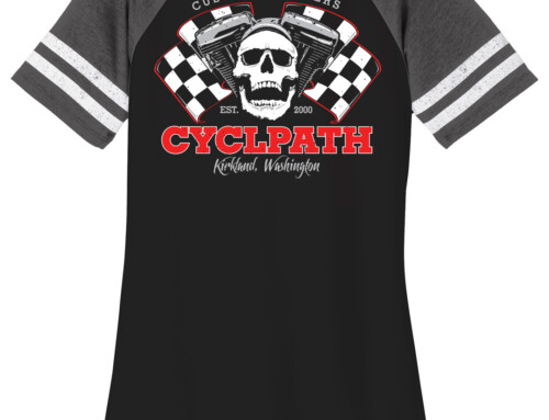
The client was pleased with the result, and immediately implemented their brand identity to promotional items, including Business Cards. We also made a run of branded shirts and jackets to promote Edmonds Security, and identify their brand at jobsites.